


An infographic is an incredible way of presenting information that works great as link bait, creates strong brand awareness, can quickly grow your subscriber list and is highly shareable. A well thought out infographic can provide a huge amount of benefits, and can be a great addition to an overall content marketing strategy.
Learn About the Top Marketing Strategies in 2018

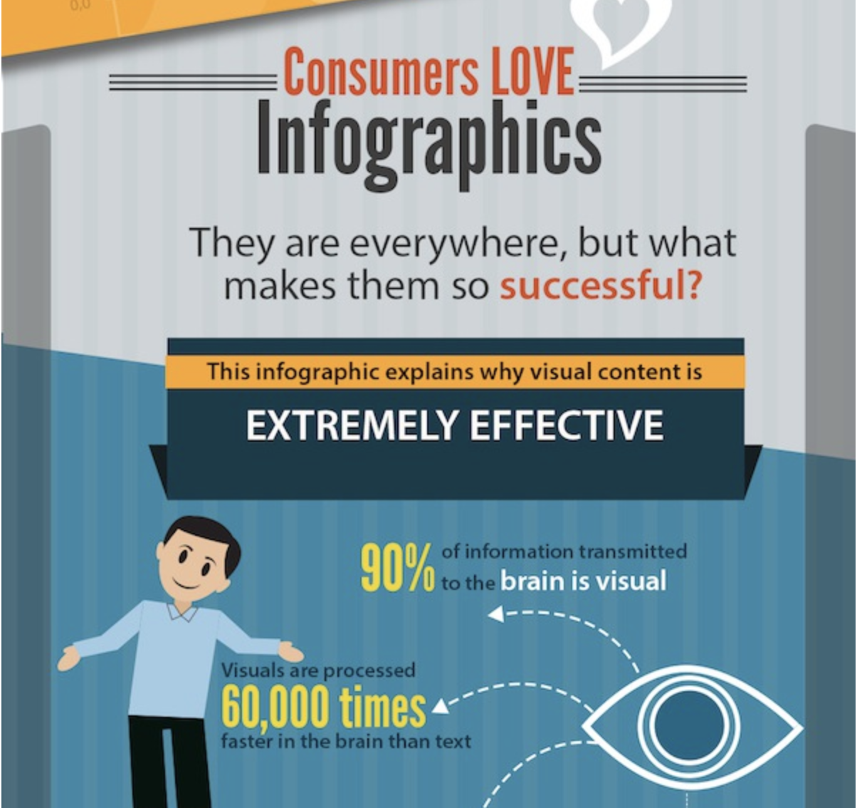
- 90% of information transmitted to the brain is visual
- Visuals are processed 60,000 times faster in the brain than text
- Infographics are 30 times more likely to be read than a text article
- Publishers who feature infographics grow 12% faster than those who do not
So how do you create that magnificent infographic? Hint: it’s more than just making it look pretty.
Read on as we list 7 infographic tips to ensure yours is a success:
Is Your Data Worthy?
The last thing you want is to create a resource that nobody will care about.
An infographic should start with data that you’re confident your audience needs. A couple questions to ask yourself at this stage include:
- Will the information I’m considering be meaningful to my audience?
- Do I have enough data to be compelling?
- Does the information I’m considering already exist online?
- If so, is it current?
- Is it easily accessible?
Start by researching a particular topic thoroughly until you have enough data to tell a full story. While infographics are concise, you don’t want them to be vague or have high value points watered down with fluffy statistics.
If you need inspiration, check out this great post from Visme on 20 Infographic statistics you need to know.
Story Outline
The story should be data driven, and planned out early in advance. Your statistics shouldn’t appear randomly, they need to follow logic and flow naturally. Before you start thinking about developing content for your infographic, the first step is to organize your current data.
Categorizing
As a content marketing agency, we like to use mind maps for pretty much everything, but you can use whichever tools you’re comfortable with. Start by organizing your statistics and information into categories. It’s best to identify your top data points, and build around them.
Some considerations here include:
- What information will be most meaningful to my audience?
- Which statistics go well with each other?
- What information might not be necessary to include?
Hierarchy
Once you have your data organized into groups, it’s time to consider the hierarchy.
Think about what the main sections of your infographic will be, and which order makes the most sense to present them in. A natural hierarchy should begin to take shape, and as this happens you may find yourself moving information around to different content categories. This is a good thing, and don’t stop making iterations until you’re 100% happy with how everything fits.
Once this stage is complete, you should have a very solid structure of the data you will be presenting organized into tightly themed groups, with an established hierarchy.
Consider Your Audience
This is a recurring theme in this article, but the key to good content lays in aligning it with your customer personas questions, challenges and interests. It needs to be based on a value point you have identified is important to them.
Ask yourself what need is this fulfilling? Reach out to your audience as early as possible and enquire with them if they care about your ideas. This can be as easy as a 1-3 question survey asking them to select which topic they are most interested in.
If you already have your customer personas well mapped out, there’s a good chance you have more than one. Don’t try to create one all mighty infographic and expect it to be a perfect fit for all of your personas; it won’t work.
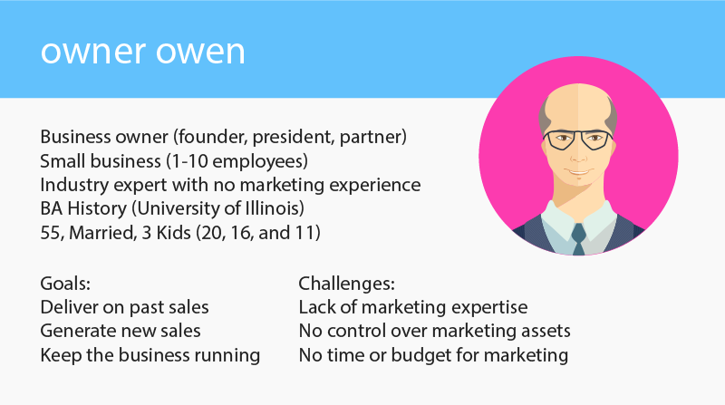
Example: At Roketto, we have 2 infographic offers targeting the following personas:
Business Owners - Infographic contains information to help owners of SMBs fast track sales with proven strategies and trends. This is effective because our research shows this persona doesn’t care about marketing, they’re interested in bottom line results.
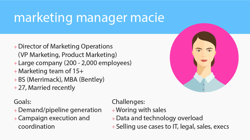
Marketing Managers - Infographic includes current stats and data driven insights on how to improve results from marketing. This persona is responsible for driving qualified leads, but not sales, so this content ties perfectly into their role and needs.
A little planning and research in the beginning will do wonders in ensuring your infographic will hit the mark with your target audience.
Voice and Tone
While this might not play as big of a role as it does in other content marketing areas such as blogging or guides, your company’s voice and tone needs to remain consistent throughout all of your marketing efforts.
Even if your infographic doesn’t include one full paragraph of text, consider how you can inject your company’s personality wherever possible. Be creative here, a couple ideas to get you started could include:
- Playful headlines
- Educational speech bubbles
- Hot tip bars
- Witty internal quotes
- Image or icon captions
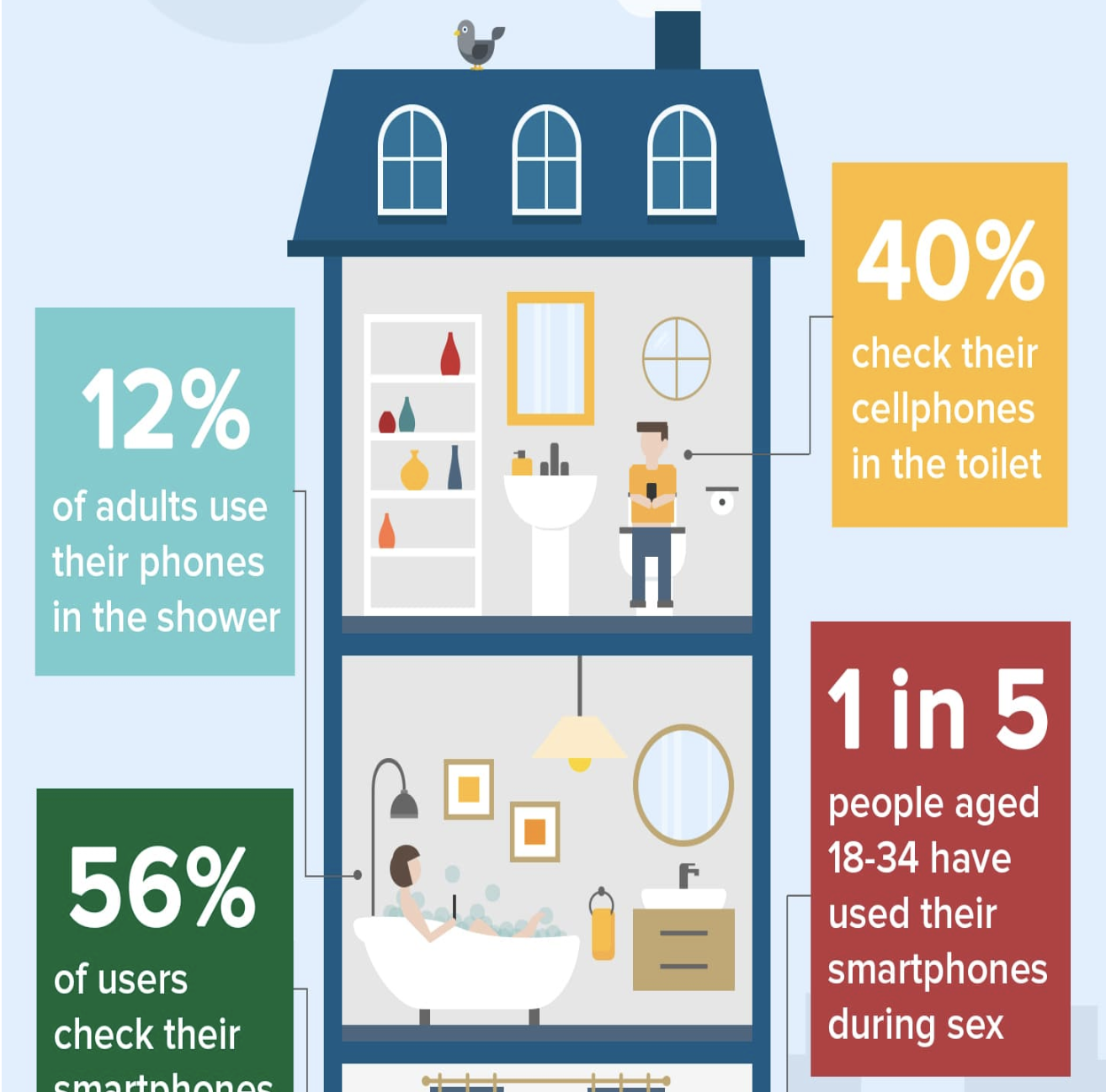
We love this example by Trust My Paper where they make terrifying statistics of cellphone usage exciting and fun.
With a little effort, you should be able to bring the same energy to your infographic as you do in your other content marketing materials. Maintaining this style consistency is vital to building your brands personality, making it authoritative and recognizable.
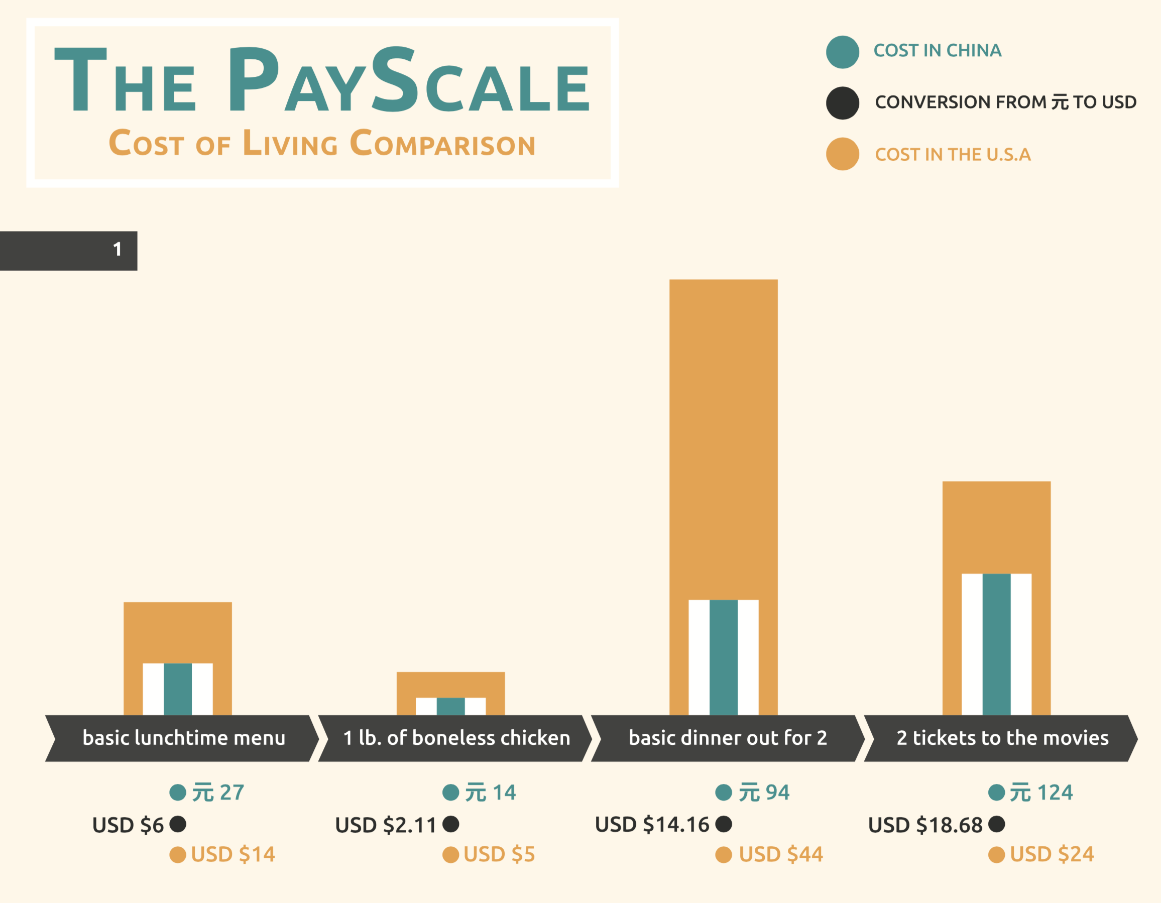
Simplify
One main challenge of creating infographics is that you need to say a lot, with very little. Remember, these are supposed to be visual, so the last thing you want to do is lose your audience in a sea of text or redundant, confusing content. The more that can be said through icons, graphics, illustrations and charts the better.
Depending on what you are creating your infographic about, you may have complex data that can be difficult to present. The goal here should be simplifying your data as much as possible, so that it can be presented in a way that your audience can process and digest it effortlessly.
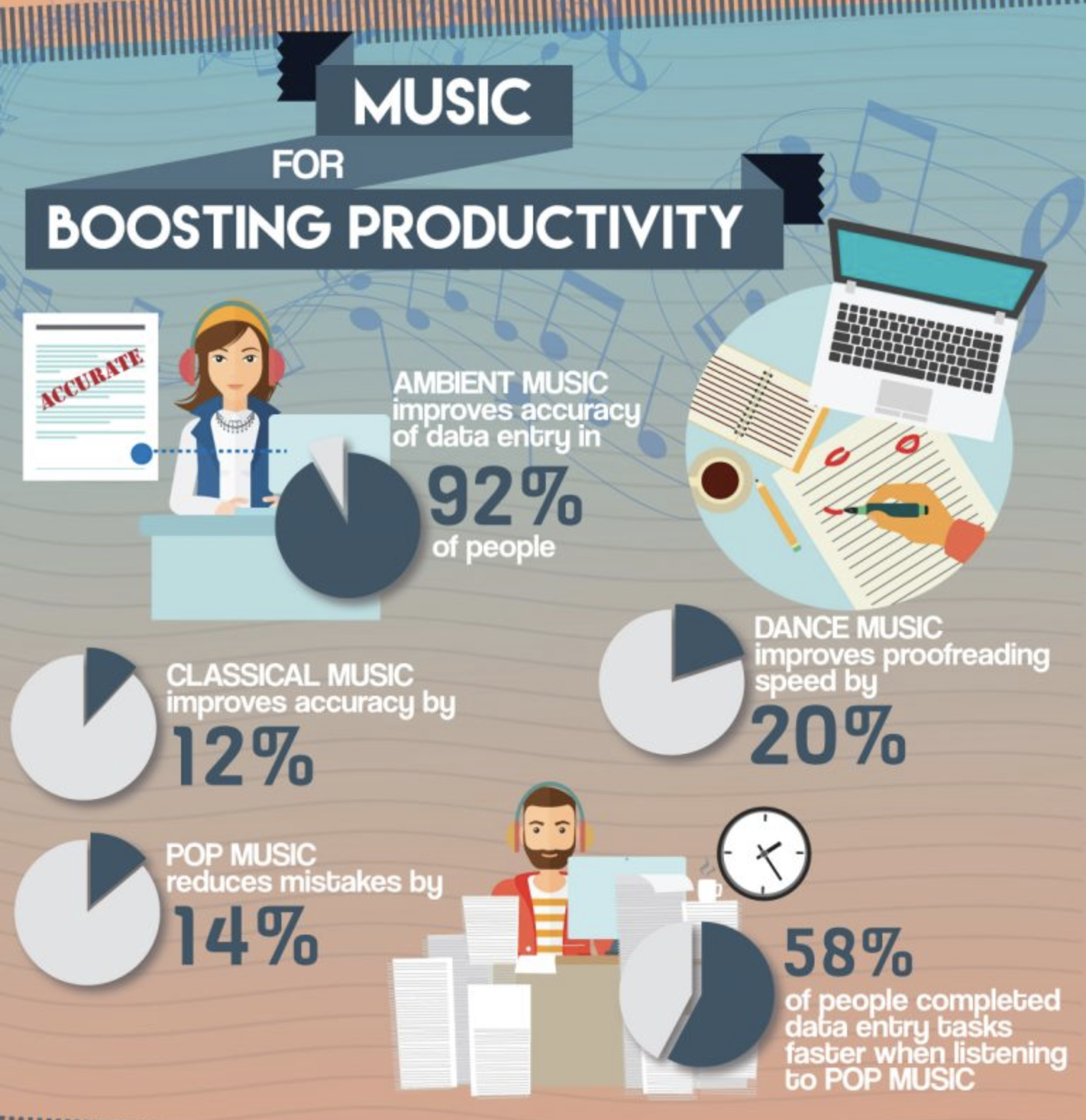
Below is a fantastic example by WebpageFX on explaining productivity benefits of music in the workplace. There’s a lot of information and data here, but it’s simplified in a way that can be easily and quickly digested.
Be clear about what you’re offering, and don’t stray from your main value points. Include only the information and statistics that support your core topic, and remember that more often than not, less is more.
Design
The design of an infographic is about much more than just the aesthetic. It needs to accomplish many things such as:
- Highlight key items
- Direct readers through a path
- Clarify meaning
- Help avoid confusion
- Make readability easy
- Present and support the data
- Increase brand exposure
It’s not as easy as jumping in and tossing the data into charts and graphs. It’s important to be intentional with every detail. Here are some tips on steps to follow when designing your infographic:
Layout
This early component can make or break an infographic. It’s very easy for a reader to feel overwhelmed if it’s not immediately clear what they should focus on, or if there is no visual path for their eyes to follow.
Plan out the layout of your infographic early with wireframes. Don’t think of this as an extra step, we promise it will save you time.
Consider your hierarchy and content and how you are wanting to present them. It’s not always as linear as left to right, or top to bottom. Infographic layouts can easily get complex, so keep things as simple as possible in the wireframing stage.
Match your content areas with whichever layout will best suit your content. Everything should flow naturally and follow a logical order. There are many options for layout such as the following to name a few:
- Timeline
- Steps
- Sectional
- Categorically
- Checklist
- Story
- Isometric
- Map
Of course, it may be necessary to go custom or purely illustrative depending on the information you are presenting, but regardless it’s important to put the time and effort into this high level planning. Consider how all of the content will fit into your layout, and how it will flow. Focus on the order you’d like the readers eyes to follow, and make sure that path is clear.
Colour Scheme
Yes, you want your brand tied in here, but don’t feel like every infographic has to be limited to your 1-3 brand colours. Remember what we said about aligning the content with your customer personas? That is completely applicable here.
Choose your colours based on your personas demographics the content of the infographic. Try to stick to 2 or 3 main colours, and use one contrasting color for areas that deserve special attention. Make sure the colours work well with each other, and feel free to experiment with various shades.
If you go with too many different colour options, you’ll risk ending up with a poor aesthetic that could be hard for your readers to relate to.
Brand Uniformity
Please don’t misunderstand this as making sure your logo is watermarked on the file. The earlier you can plan out the design elements you’ll be using and ensure they are on point with the overarching theme your brand currently has going the better. Visually speaking, the difference between a good infographic and a great infographic can be the theme it follows, which should relate back to your brand uniformity.
Cheaply designed infographics can often look hacked together, with little rhyme or reason. Of course consistency across your content marketing is key (which we’ll cover a little further down), but this is about more than that. Don’t think you can just “sprinkle in” a few things at the end to make up your theme. An overarching brand theme should be reflective in every graphic, image, icon, shape and so on.
The thing about content marketing, is that everyone and their dog is doing it. Brand uniformity is one of the small but important ways you can step up your game, and create something that will stand out from the noise.
Brand Mascots
 If you’re lucky enough to work at a company with well illustrated brand mascots, infographics can be a killer place to utilize them. There is great power in brand mascots as they are visual, likeable and recognizable. A popular example would be Roger from Moz.
Think about getting some versions created within the context of your infographic. Seeing your mascots tightly related to the content will help boost your brand power big time!
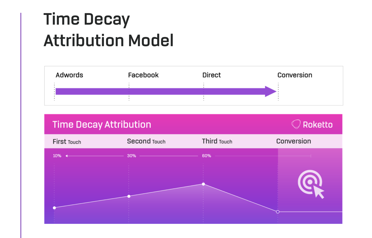
Visualize Data
Perhaps one of the biggest challenges of cramming a ton of information into a small space is visualization of the data. The goal is to make it easily apparent what every graph, chart, stat, etc. is for, and why it fits in the infographic.
At this point all of our data should be nicely organized, so this should just be a matter of choosing the best way to display each data type, be it discrete or continuous data. There are lots, to name a few:
- Bar
- Column
- Line
- Area
- Numerical
- Pie
- Donut
- Scatter
- Bubble
- Axis
- Stacked
Don’t just go with the first thing you try. Experiment with every presentation style until you find the one that works with your content the best, and you have a good reason for choosing it.
Consistency
It should go without saying that consistency is key, yet this can be an area many struggle with. This relates to every font, image, graphic, icon, chart, graph, colour and every other element on your infographic.
It’s easier to mess this up than most think, which makes the planning stage that much more important. Gathering all design elements before you start will allow you to compare everything before you start working with it, which has much lower risk than if you are “designing as you go”.
Example - If you are using icons, make sure you only use icons from that set and in that style. Collect ALL required icons beforehand so you don’t commit to a set just to find out it doesn’t have everything you need.
Negative Space
← use it →
Promotion
No matter how amazing your creation, there’s no guarantee many people will see it unless you already have a large active audience. Promotion should be included in your content marketing strategy, and we’ll go over the most effective ways to get your infographic in front of the right audience.
Social Networks
Promote your infographic on your social networks, and if your audience is too small, try boosting your post to reach more viewers. Target people with interests that relate to your content, and match your customer persona demographics.
Email Subscriber List
Utilize your precious subscriber base, and turn them into loyal promoters. These are people who already like you, and sending them high quality content should be received well.
Make sure that you segment your list if needed so you’re only sending it to subscribers who will be interested, and make it as easy as possible for them to share with their own networks.
Calls to Action on Top Pages
Add calls to action on your home page, and other high traffic pages and blog posts. Making use of your current site traffic is great, but be strategic here and always ensure it’s relevant.

Search Campaigns
Depending on the keywords you are targeting, it can be strategic to send paid search traffic to a landing page with an offer that is inline with their search queries. Just be sure to include a clear description in your ad text so they know what to expect.
Affiliates
Reach out to your affiliates and ask them to help you promote your infographic. Are you a regular contributor, sponsor, partner, colleague or even friend of any other companies or websites whose audiences could benefit from your infographic? We’re not telling you to spam anyone here, but sometimes all it takes is asking politely.
Now you should be on your way to creating an infographic that will help get your brand recognized and play an important part in your content marketing strategy. Feel free to reach out if you need a hand, we’re here to help!
Share This Article

2.png)
2.png)